All posts related to V3
User avatar
By Tok_Tok
#385204
Hello all,

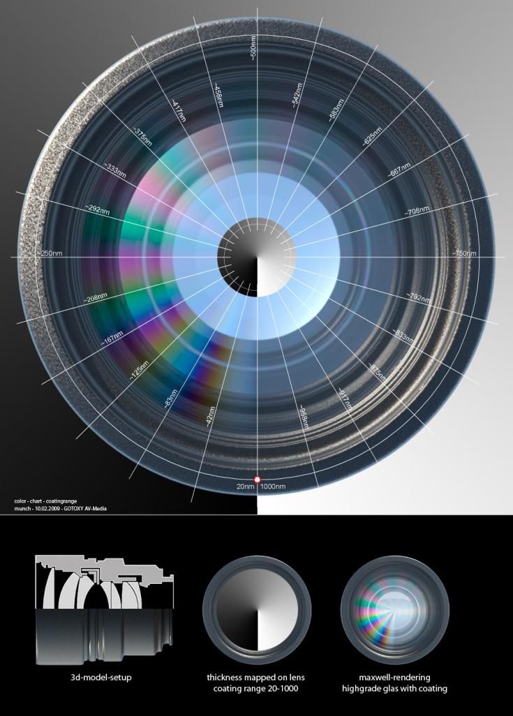
I want to create an oil coated polycarbonate material. I've been trying settings for a few days now but I can't seem to get it right. In the example below the colors in the coating are very saturated and they also seem to be represented in a wide variety. The pattern the colors are following is probably created by the tension in the material. This will probably be hard to achieve as they have to painted on the 3d object in a bump map. So I'm currently focusing on the colors but I can't seem to get them to look the same way.

Example:
Image

My attempt:
Image

Another attempt:
Image


I use a bump map on a coating to get the different colors. I want the colors to be more saturated and closer to each other, as in the example. More like a rainbow effect. Also the plastic (polycarbonate) should be more transparrent, or the coating thinner, but with the colors still very visible.

Does anyone has experience with this or tips? Would be very much appreciated.

This is the material I've been working with: https://www.dropbox.com/s/t6ff5wz6csbl7 ... 5.mxm?dl=0
By bograt
#385272
You can be pretty sure your reference was shot using both a polarising filter, and a polarised light source. With that in mind, matching it exactly could be tricky in Maxwell because it is impossible to simulate polarised light.
Your reference image is backlit so you are also dealing with refraction far more than reflection.
Are you actually trying to simulate polarized plastic? or an oily coated poly-carbonate? the reason your material does not match the reference is A: because your reference is cross polarized so any direct reflections are removed (lack of saturation etc). And B: because your material is calculating colors based on a layer of thin film interference on top of your plastic, rather than the refraction of the object itself (lack of shifting hues). What is this material intended for?
User avatar
By Tok_Tok
#385275
Thank you for the in-depth information. I was suspecting the way of photographing was creating this effect because I never saw the effect this intense in the real world.

The client wants the same effect on muffin- and donut cups in the real world. I have to make a visual that demonstrates this effect on the desired product, which would give the manufacturer a good impression on how the coating should be applied. So I'm trying to simulate oily coated poly-carbonate (PC). Polarizing filters won't be any use to me because one would have to see the same effect in the same world.

I changed the background to a dark grey and made material less reflective in the Reflection 0 parameter. Which gave me this result:

Image

The colors are much less vivid but this is a much more realistic effect on how the product will roll out of production. I'm still rendering another one which has slightly more vivid colors but the process is slow due to the material being slow to render.

I'll post more result when their done.
User avatar
By Tok_Tok
#385282
This is the latest I'm using, mind that one layer is turned off: https://www.dropbox.com/s/iwbvlgfureenu ... 6.rar?dl=0 Hope you can open it now.

You can took a look if you're interested but the client wants this job finished by tonight so I'm rendering the final images now. I'm happy to discuss this material some more, it's interesting how the coating behaves on various nanometers thickness! The Maxwell documentation also doesn't provide much information about this although there was an article on the maxwell blog a while back about coating. What I would like to know is which color will appear with which thickness of coating, that way it would be somewhat more predictable when using a texture as variable. If I find the time I'll do some tests.

These are a few of my last renderings:

Image
Image
By bograt
#385285
thanks for uploading again, but I think my software is a bit old to open it. Your material looks a bit better now. To get strong colours you need the right thickness ~150 - 600nm seems to work well and low fresnel ~1.3-1.6Nd... I was going to suggest creating a strong coating reflection and balancing the intensity of the color chips with the color chips of the bdsf e.g for more color, lighter chips in the coating and darker for the bdsf, and vice versa. It looks like you more or less got the results you were after.
In my experience the behavior of colors in a coating material can be very erratic as there are quite a few elements at play. You can be sure though that using thicknesses at the lower end of the visible light spectrum will create strong colors because of the interference.
User avatar
By Tok_Tok
#385287
I use Maxwell 3.1

Yes it's much better now. Still not what I wanted to achieve but it's good enough for now.

I never went below 3.0 on the ND settings, mostly tested with 7, 12 or even higher but those only gave me unrealistic results. So I tried what you suggested and that seems to work very well,l these are the settings:

Image

The first BSDF and BSDF Vonoroi are exactly the same. The BSDF Vonorio uses a simple vonorio procedural texture with the size set to 8.

Before I was using two BSDF's with a coating (one used a simple gradient) but that slowed the renders a lot and also gave a bit to much color so I removed that.

I rendered a test on the simball with your suggested settings (Nd a bit higher):

Image
User avatar
By eric nixon
#385295
That chart was in an earlier manual, but coatings have been fixed since then, so the chart is out of date, which is why its not in the manual anymore.
User avatar
By Tok_Tok
#385304
Yes I remember the Maxwell 1.0 logo being a camera lens - "As easy as taking a photo". That's what literally got me interested in Maxwell back then.

But I don't understand why they would just remove that information, it seems to me you would update it not remove it.

Rendering such an effect isn't hard at all but mapping the thickness is something I don't know how to do. This is just a flat render of a squeezed sphere but works well, 20 - 1000 nm (pixel density could be a bit higher):

Image
User avatar
By Mihai
#385305
Thickness mapping for coatings is exactly the same as roughness mapping - but here you can also specify a min value (where in roughness mapping min is of course 0). So darkest parts of your map will be 20nm in your case, brightest parts 1000nm.

If you put an ND so high which you did in the beginning (7, 8) of course the whole coating will look extremely, unrealistically reflective. Stick with normal ND and use force fresnel unless you want to mess with the refl0/90 colors also, but in this case since you want the colors only to come from the thin film interference itself and not anything you might have set in the 0/90, just set them both to black and turn FF on.

A range of 20-1000 (or perhaps a bit less max range) seems to work well and together with procedurals in V3, this material can be made in no time :)
The idea is that the larger the range, the more variation in the visible spectrum colors you will see. But this is until a certain max thickness. If you set it too high then the thin film won't be so thin anymore = no more "thin" film interference = no rainbow coloration. So if you want the most rainbow 20 to around 1000 seems good. If you want a more specific range of coloring, change the min / max, but try to keep the max up to about 1000.

EDIT: Actually 20 might be too low, try starting with 100 as the min range, gives a less "blank" beginning of the rainbow range. 100-700 for example.
EDIT 2: Use the floor preview scene to get a good idea what different min max settings do. You will also see that if you increase the max to something very high like 4000 the interference pattern will start to shrink and repeat, while at grazing angles you'll just start seeing "normal" reflections.
EDIT 3: From your first example, there is less blue spectrum and more yellow/greens. Try a range of 350 -850 and see if that fits better than 20 - 1000 in this case.

Image
User avatar
By Tok_Tok
#385322
Mihai wrote:The idea is that the larger the range, the more variation in the visible spectrum colors you will see. But this is until a certain max thickness.
What I didn't realize is that the spectrum repeats itself, this will probably be at different wavelengths but to the naked eye it seems so. At first I thought that rainbow range was going to be visible once say 50 nm - 500 nm and then fade away.

I'm now using 155 - 500 and it works well. But again I didn't know green isn't visible until a higher thickness. An example in the manual would have helped me :)
Sketchup 2025 Released

Thank you Fernando!!!!!!!!!!!!!!!!!!!!!!!!!!! hwol[…]

I've noticed that "export all" creates l[…]

hmmm can you elaborate a bit about the the use of […]

render engines and Maxwell

Funny, I think, that when I check CG sites they ar[…]