- Wed Apr 02, 2008 5:07 pm
#265607
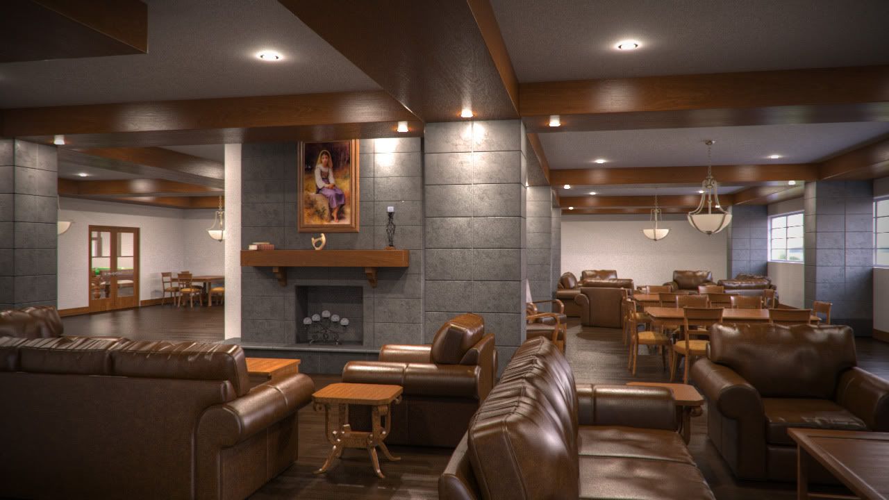
Looks good Brian!
though there's something wrong with your floor material.
Look at the last image, the reflections from the windows are great, but the reflections from the white wall with 3 spots looks very strange.
The same problem is visible in the game room render.
though there's something wrong with your floor material.
Look at the last image, the reflections from the windows are great, but the reflections from the white wall with 3 spots looks very strange.
The same problem is visible in the game room render.
Application & OS: [Maxwell Studio][Ubuntu 14.04]
Workstation: In the build...
Renderservers: Rebus
Workstation: In the build...
Renderservers: Rebus


 - By Matteo Villa