
- Tue Apr 17, 2007 2:30 am
#221400
So I've been showing this to a few people and I keep getting the comment that you can't tell this render from a Vray. Which is absolutely frustrating because I'm obviously not looking for a vray look with this (if all I'm achieving with m~r is vray 'like' images I might as well use vray).
so where am i going wrong here?

look for honest critique and direction. The subject matter is boring I know but I'm using this as a case study in achieving realism and don't want to be fixated on the 'design' of the building itself (it from an old project of an existing school building).
Settings:
Phys. sky - sun (madrid) gmt 5 - hour 13 min 30
all mats are two bsdf simple blends (90-10 or 85-15 mixes except for the glass).
Luis
PS - need to add a fence around perimeter and move phone stands.
____________________________________________________________
So I've spent some time studying brick (it's funny being out in public and staring at a brick wall people think you're freakin nuts).
Here's my first attempt at dirty-ing up the brick facades. I did the two major facade and but haven't done the front bay yet Just looking for some feedback that I'm on the right track.
I'd like to focus on the asphalt next as I agree with Mihai's statement of how boring it is.
Luis
PS- Oh I obviously changed the lighting to focus on the front of the building. I had to reduce the intensity of my hdri illumination.

so where am i going wrong here?
look for honest critique and direction. The subject matter is boring I know but I'm using this as a case study in achieving realism and don't want to be fixated on the 'design' of the building itself (it from an old project of an existing school building).
Settings:
Phys. sky - sun (madrid) gmt 5 - hour 13 min 30
all mats are two bsdf simple blends (90-10 or 85-15 mixes except for the glass).
Luis
PS - need to add a fence around perimeter and move phone stands.
____________________________________________________________
So I've spent some time studying brick (it's funny being out in public and staring at a brick wall
Here's my first attempt at dirty-ing up the brick facades. I did the two major facade and but haven't done the front bay yet
I'd like to focus on the asphalt next as I agree with Mihai's statement of how boring it is.
Luis
PS- Oh I obviously changed the lighting to focus on the front of the building. I had to reduce the intensity of my hdri illumination.
Last edited by lsega77 on Sun Apr 22, 2007 12:26 am, edited 2 times in total.
Life is a kick in the nuts... Wear a cup!


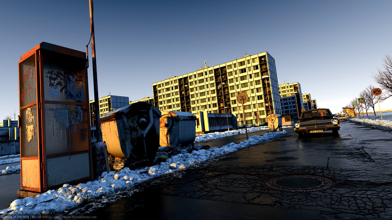
 - By Matteo Villa
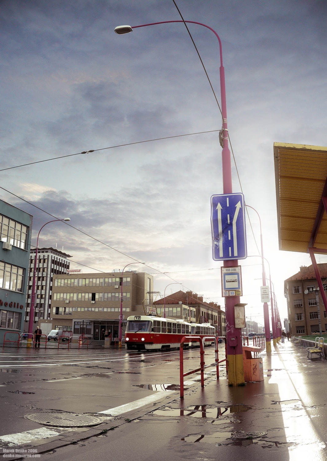