Add here your best high-quality Maxwell images.
By itsallgoode9
#295000
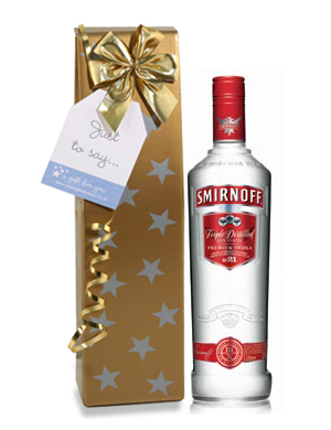
I think i'm ready to call this one finished for now. Proabaly a few things I'd like to go back and do at some point, but I'm happy with it for now. As always though, feel free to give any suggestions.

here's the SUPER high res bottle, if you're interested in seeing closer:
http://img4.imageshack.us/img4/3231/smirnoff21.jpg

Image[/img]
Last edited by itsallgoode9 on Tue Mar 31, 2009 7:38 pm, edited 1 time in total.
User avatar
By Leonardo
#295001
this is a joke... right? :shock:


I can't see much of the grain from the dielectrics... :shock: how long did you cook it... and what was the SL?

EDIT- oh yeah! I forgot to mention.... it looks awesome!! :D (but you already knew that :wink: )
By itsallgoode9
#295005
Thanks for the compliments Leonardo!

I really wish I could tell you how long it rendered for, but I do not really remember at this point. It was kindof an on and off project for the past few weeks. I'm pretty sure once i got the final lighting setup I just hit render and went to bed.

When doing this image I did it in four passes I think. I rendered the cap, the labels, the bottle and the ground reflection all seperatly and put them together in photoshop. I did a fair amount of lighting adjustmetns in photoshop to get the final look. Mostly just levels and saturation stuff
User avatar
By JorisMX
#295012
I really like your lable materials including the very nice bumpmap.
May I ask how you created it?

As far as lighting goes I must differ to the previous posts...I don't like it too much. The bottle looks flat and has no "body".

This is because you only have something happening on the edges.
The rest is more or less a dull gradient.

In real photography the back of the clear bottles are often coated with dulling spray to allow the light to spread like for example with a bottle that had high roughness.

Perhaps you should try to raise the roughness values on the polygons on the back of the bottle.

The chrome part of the lables would look alot more real if the gradient/reflection wasnt as high. Nice chrome/silver effecty normally go from clean mid grey to almost 100% white.

Not trying to knock you here, just some of my first thoughts.
User avatar
By -Adrian
#295015
Nice work!
User avatar
By caryjames
#295016
I opened the higher res file and had a look. I really like your subtle bump map on the label- also the metal reflections on the label look spot on.

I just recently bought a book on studio lighting for product shots and your render could be included in this book no problem- I really like the composition and the lighting!
Thanks for sharing.
User avatar
By gotoxy av-media
#295035
nice work!

i have to agree with JorisMX concerning the light...(also useful photographer trick, making the back of bottle more dull)

but maybe the light-position is a client-wish?!

but what i wanna know is about the banding in the background...is this because of jpg-compression?

munch
By itsallgoode9
#295057
Thanks for the feedback everybody.

The lighting is based off of the general lighting that is used in alot of smirnoff images that i've been able to find online. here's a couple quick samples I dug up. After seeing these, let me know if your opinion has changed

Image

Image

My lighting isn't identical, but I wanted to use images like these as a reference point.

The banding in th background is from the compression. While talking about the background, i'll probably brighten it up a bit to make the image less gray overall

I will keep in mind dulling the back of the bottle for future bottle renders, I think that could make things much easier to get my desired lighting!
Help with swimming pool water

I think you posted a while back that its best to u[…]

Sketchup 2026 Released

Considering how long a version for Sketchup 2025 t[…]

Greetings, One of my users with Sketchup 2025 (25[…]

Maxwell Rhino 5.2.6.8 plugin with macOS Tahoe 26

Good morning everyone, I’d like to know if t[…]