Add here your best high-quality Maxwell images.
User avatar
By Tim Ellis
#107012
Image

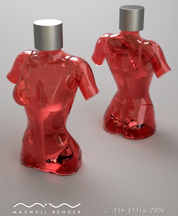
Click thumbnail to view, then resize in bottom right corner of the image.

This was rendered before I changed my studio lighting setup, so forgive me if it's not all that good. 9hrs @ 800x600 Samples 17.54 of 25.

Tim.
User avatar
By ivox3
#107040
It looks good Tim, ...I'm more concerned with the compression that the image server is using. Perhaps on your end you could adjust your resolution and get a better result. I've seen this many times and it can be fixed. I'm sure at sl17 it looks quite clear at your end , ....it just looks aliased and blurry around the edges.
User avatar
By Tim Ellis
#107056
ivox3 wrote:It looks good Tim, ...I'm more concerned with the compression that the image server is using. Perhaps on your end you could adjust your resolution and get a better result. I've seen this many times and it can be fixed. I'm sure at sl17 it looks quite clear at your end , ....it just looks aliased and blurry around the edges.

Did you resize the image when it opened mate? You need to click the little icon that appears in the bottom right corner of the image. ;)

If you did, then perhaps it's down to my optimisation for uploading to the web. I don't put huge jpeg files up as they tend to slow the forums down a lot. This one is 102kb, reduced from 300kb that M~R produced.

I'll do another version for my website that isn't quite so compressed.

Tim.
User avatar
By ivox3
#107064
yeah, ...not good. :lol: need something better.
User avatar
By Tim Ellis
#107066
However, do you think it could be a focal length issue? The scene is correctly scaled, with the camera target set in between the two bottles.

:?:

Thanks,

Tim.
User avatar
By ivox3
#107075
no. ....i think not. It's not that kind of blur ........
User avatar
By -Adrian
#107110
Looking very cool, i like it. Only the cap bothers me a bit, dunno why.
User avatar
By ivox3
#107114
-Adrian wrote:Looking very cool, i like it. Only the cap bothers me a bit, dunno why.
....I think it's because their in a strict contrast to the body design and color. I think that a simple fix would be to change the color to glossy white(or red).
User avatar
By Tim Ellis
#107146
ivox3 wrote:
-Adrian wrote:Looking very cool, i like it. Only the cap bothers me a bit, dunno why.
....I think it's because their in a strict contrast to the body design and color. I think that a simple fix would be to change the color to glossy white(or red).
I'll have a tweak and run some variation renders on the cap material. I'll also use the better studio setup. Just need more hours in the day to render everything. :roll:

Thanks


Tim.
By Becco_UK
#107321
I like design of the 'bottle and its red dialectric material but the black patches at the base do not look right to me. Is the black a reflection or to do with known dialectric problems?
Help with swimming pool water

I think you posted a while back that its best to u[…]

Sketchup 2026 Released

Considering how long a version for Sketchup 2025 t[…]

Greetings, One of my users with Sketchup 2025 (25[…]

Maxwell Rhino 5.2.6.8 plugin with macOS Tahoe 26

Good morning everyone, I’d like to know if t[…]