Hey JD,
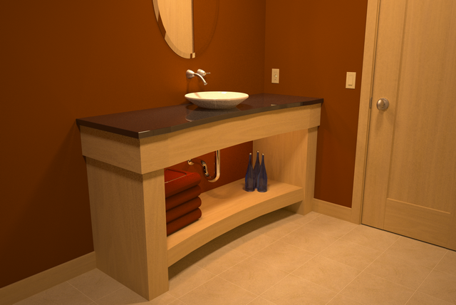
you're welcome and I'm eager to see some images with the beautiful
maple and that finish you're talking about. And the design is not my
concern, it is more the texture. Well I don't know how it is called in
english, maybe 'laminated fiber' but I'm not sure. That is how it looks
like, well ... a lil bit. Anyway, I like the contrast between the nice red
color that has been used for the wall and the bright wood.
btw. the winebottles look like cidre (applewine), I know those blueish
bottles.

Well, and the software that I used to process your image was Photoshop,
but I use it a lot and not only for post but for drawings. I'll have a look
at the Ulead PhotoImpact and will see what I can do with it. ;o)
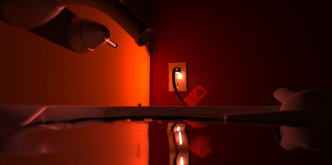
Hmm, ... since you've been using 'cold white' emitter my guess for the
yellowish style of the picture would be colorbleeding from the wood
texture. Well, lets hear some other opinions, because I'm also kinda
new to rendering ... well almost.


NB.: Don't worry about the design to much, I'm german and I'm not
used to this 'design' even when my sister is living in Virginia ... hehe.
edit: I've downloaded Ulead PhotoImpact trial and fired it up
to see what I can do with this lil soft. Well ...

... at this image I've used the ExpressFix (F10) wich 'guides' you through
some steps. It works quit well, but if you need more control then you have
to use the other controls under photo -> light and color. If you don't have
the time to learn the "whole" image processing stuff, then the ExpressFix
is the way to go.
I hope this is a lil bit helpful for you, at least a start. ;o)
NB.: I'm not a profi at all, so no bitching allowed ... hehe.
edit2: ... haha, if you compare the processed pics, the first one
is to redish. I guess I should get my monitors calibrated ... well, no!
NB.: PhotoImpact is doin' a nice job here, no need for you to get Photoshop. ;o)
take care
Oleg

