Page 1 of 1
Neon Sign
Posted: Tue Mar 24, 2009 1:02 am
by marked001
quickly put this together for a postcard for a local architectural organization's design awards... postprocessed with sky and some dirt on the foreground building..
render

wire

Posted: Tue Mar 24, 2009 9:48 pm
by fellazb
Good modelling, dull image.
It's way too flat. Add some drama to it. More contrast and colorcorrection could do so much more. Maybe some depth of field could spice it up too.
It's not a crime to do post processing even if you render with an unbiased renderengine.
Don't mean to harm someone here, but alot of images I see on the maxwellforum lack contrast en warmth.
Posted: Tue Mar 24, 2009 10:21 pm
by m-Que
Must agree...It needs something more.
Sorry, but I first thought it's a screenshot from some older PC game
Posted: Tue Mar 24, 2009 10:38 pm
by JorisMX
Theres not alot of Light being emitted from the neon letters.
You have a vast amount of light coming form the building actually distracting from the typical flashing lights, bloomy style of neon lights and red light strips.
I think you need ALOT more contrast and perhaps some nice reflections of the neon sign. Other Idea might be to add a little motion blur in post to a nice effect... just some ideas.
Here's a few references I just googled (sorry for the highres..

)


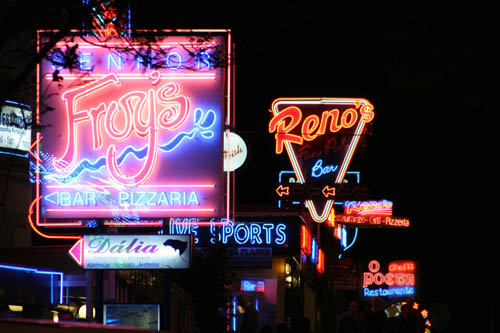
and my favorite.....DRUUUGS


Posted: Tue Mar 24, 2009 11:21 pm
by markps
also... to be more realistic, the letters can't be continuous. The neon tubes have beginning and an end and since these tubes are bent by hand, they usually have some inconsistencies and intricate folds to make each letter.
Posted: Wed Mar 25, 2009 2:31 am
by marked001
thanks for the constructive comments, guys... banged this out in a couple hours... hopefully i'll get some time to take it further based on your comments.
Posted: Wed Mar 25, 2009 5:10 am
by ivox3
My monitors aren't properly calibrated , ..but this looks good to me.
Marked001, ...I thought that the worked looked pretty solid -- just a bit color rich.
What do we think ?

Posted: Thu Mar 26, 2009 1:09 am
by PA3K
I agree with previous posts ... Hopefully You don`t mind if I will add another photoshoped version.


Posted: Fri Mar 27, 2009 12:52 pm
by segnoprogetto
Good work !

