Page 1 of 1

Finished exterior rendering

Posted: Tue Nov 04, 2008 12:24 am
by Asmithey
Hello,

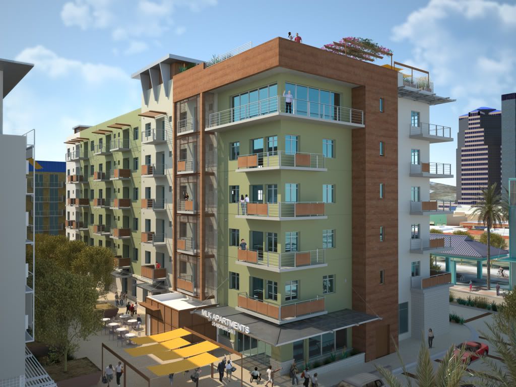
I rendered this at 2600x2000 on my Intel 8 core over night to 16 SL. Some of the people are Photoshoped in and some are models rendered with the scene. All the plants and tress are models within the scene. The rusted metal paneling could have used more work to make it look more 3 dimensional and not so flat. The painted EIFS areas look too flat as well. The surfaces could have used some irregularity to depict typical non perfect construction finishing methods. The far away buildings could have used some reflectivity in the glass as well. Please comment on anything you see that needs a critique.

Thanks,

Aaron

Image

Posted: Tue Nov 04, 2008 1:14 am
by Mihai
Many of the materials could use a bit of reflections, especially the wood panels. There are rarely any perfectly diffuse surfaces around and a bit of reflectiveness can really add life to the image.

Posted: Tue Nov 04, 2008 1:22 am
by Asmithey
Actually none of the materials are Lambert but still lacking in reflection as you have mentioned. The wood paneling you mention is actually rusted metal panels. They are way to diffuse.

Thanks,

Aaron

Posted: Tue Nov 04, 2008 1:45 am
by Mihai
Ah :) Even more reason to make a good roughness map/weight map for it. You could probably reuse the diffuse map and adjust it using the image controls.

Posted: Tue Nov 04, 2008 4:10 am
by Bubbaloo
Mihai brings up a good point. Most materials can be vastly improved with a good roughness map / reflection layer weight map. Add bump to that!

Those yellow shades could use a little transparency, no?

I like the material on the grey canopy (looks like a mesh).

Posted: Tue Nov 04, 2008 5:31 am
by Josephus Holt
The trees in the left foreground look really good....Onyxtree?

What app are you using for the 3D people?

I would work some also on the repeating pattern of the rusty metal.

I agree with your own observations....feel like the surfaces need some roughness/irregularity.

The white flat roof to the left of the MLK sign is way too clean....same with the yellow canopies...being flat they're going to collect a lot of dirt.

I like the composition with the grey building on the left in the foreground, but the grey is an unidentifiable (no texture?) material...especially should show some texture since it's one of the closest objects.

Last comment...I'm struggling with the light to dark values, the greatest contrast seems to be to the right in the background, hence drawing my eye there, whereas the least contrast in the image is right in the middle. Can not find a focal point, except perhpas the yellow canopies/awnings ....or maybe the fellow trying to get my attention in the penthouse :lol:

Posted: Tue Nov 04, 2008 9:16 pm
by Asmithey
Yea...

This was actually my third Maxwell project. I did this back in February of this year. After working on other projects since, things really started to become clear that there were many issues needing attention with this project. So, I though throwing it up here would be good, and it was. So, when I find time I will try and make it better and re-post it.

Thanks for your comments.

Aaron

Oh, all the trees are x-frog and the modeled people are from axyz. They are on the roof.

Posted: Mon Dec 29, 2008 12:19 pm
by segnoprogetto
Nice job ! :wink:

Posted: Sun Jan 25, 2009 8:42 am
by Asmithey
Thanks!!!!

Aaron