Page 1 of 2
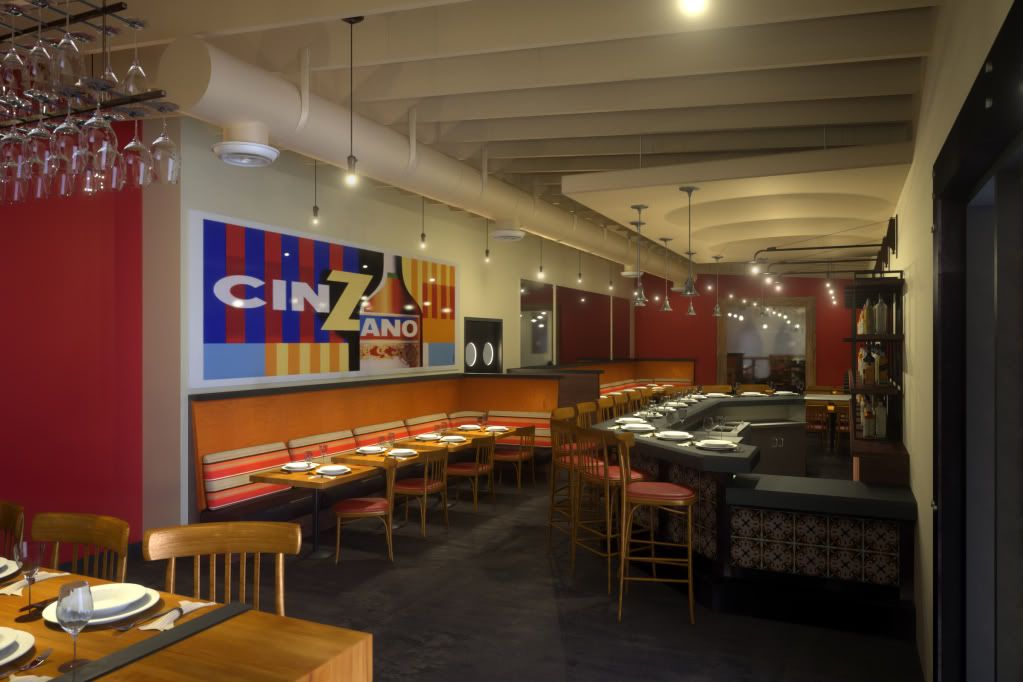
Finished Interior rendering of restaurant
Posted: Fri Aug 01, 2008 7:00 am
by Asmithey
Here is my completed image for the restaurant rendering I have been working on. The final image size is 2400x1600 at 19.25 SL. Rendering time was 126 hours on my computer. Comments appriciated.
Aaron
Posted: Fri Aug 01, 2008 7:07 am
by JTB
Great!
Posted: Fri Aug 01, 2008 7:54 am
by Mattia Sullini

nice! It just seems not contrasted...but maybe it's the monitor i am using now!
Posted: Fri Aug 01, 2008 8:03 am
by Asmithey
Thanks guys.
You know it looks washed out a bit on my monitor as well. The print displayed much more contrast though.
Posted: Fri Aug 01, 2008 8:39 am
by pendi
good work
Posted: Fri Aug 01, 2008 9:51 am
by NicoR44
I have to say wooow wooow wooow!!

except for the wine glasses they look a bit strange to me, the hanging glasses look fine to me, but the ones up front look a bit pasted in
Posted: Fri Aug 01, 2008 10:32 am
by tokiop
Wow, very nice and convincing!
In my opinion the slight lack of contrast adds realism versus the classical perfectly (/overly) contrasted and saturated colors of renders.. great work, and the scene must have been quite a challenge !!
Only criticisme would go to the front glasses too, and the strong light reflections on the hanging one which catch a bit the eye.
Posted: Fri Aug 01, 2008 2:21 pm
by -Adrian
Superb! Your tests at the beginning have come a long way.
Posted: Fri Aug 01, 2008 2:45 pm
by Asmithey
Thanks for the comments.
I agree about the wine glasses up front on the table. I do not understand why the ones hanging above look fine and the ones on the table appear to be gray and dull. It has been that way throughout the whole process. I thought with more SL they would clear up more. They did a bit. But I just do not know why they are not crystal clear and sparkly.
I agree about the light scattering of the refelected hot spots on the hanging glasses. It is distracting. I'll try a little less light scatter....Thanks.
Posted: Sun Aug 03, 2008 6:25 pm
by leoA4D
It turned out really well; nice job, Aaron.
Another item: due to the comments about the glasses here and posted in an earlier thread, I looked at the glass on the nearest foreground table and then the glass on the first banquette table beyond. This carried my eye to the table leg and base. You will want to make the base larger next time.
The lighting is quite complicated but it looks good.
Cheers,
Leonard
Posted: Sun Aug 03, 2008 7:34 pm
by Bubbaloo
This turned out great! Congrats on a job well done.
Posted: Mon Aug 04, 2008 2:54 pm
by segnoprogetto
Great
Posted: Tue Aug 05, 2008 11:01 pm
by Asmithey
Thanks for the comments. I appreciate the feed back.
Posted: Tue Sep 23, 2008 3:58 am
by wr1nkles
that glass rack looks fantastic!
Posted: Wed Sep 24, 2008 12:35 am
by Josephus Holt
The soft lighting is done very sensitively and brings out the warm colors....VERY inviting image, great job!
Maybe only suggestion would be to get wine glasses clear...they look like "smoked" glass on my monitor.