Page 1 of 1
Highland spring water. Updated 13\1\06
Posted: Tue Jan 10, 2006 9:47 am
by Tim Ellis

Updated 13/1/06. (Removed old render.)
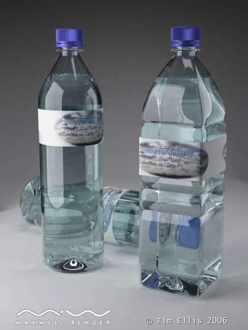
Click the thumbnail to view, then click bottom right of the image if it gets resized.
Blender 2.4 for modeling, rendered with Maxwell Render beta via 3DSMax 7.
Simple studio lighting set up, 2 200W emitter planes, one in front one behind. 20% skydome lighting. Sample level 17 reached after 9 hours.
One bump map for the cap and one Photoshop created map for the labels.
Bottle plastic is 2mm thick, water is a solid object in each bottle. (Abbe 200, ND 1.33 for water, Abbe 200, ND 1.50 for plastic.)
C&C welcomed.
Cheers,
Tim.
Posted: Tue Jan 10, 2006 9:56 am
by Jozvex
Great! The labels are slightly too big/loose but I'm sure you know that already.
Posted: Tue Jan 10, 2006 2:58 pm
by wimver
Tim,
the grey background makes the overall impression rather dull. try with off-white, and if possible let it fade to slightly darker towards the top.
in studio, everything glass (or the like) is generally photographed with 2 black panels (if white background, else white panels w. black bg) left and right behind the objects but just outside the image, so that only the reflection/refraction is visible. it adds nice contours to the glass.
then one more thing I would change is reduce the brightness of the blue from the stopper, it just looks too CG now.
have fun!
wim
Posted: Tue Jan 10, 2006 3:46 pm
by x_site
:: sorry but looks a bit more like 'highlan window cleaner'.
Posted: Tue Jan 10, 2006 5:36 pm
by ivox3
I don't know what the mapping issues in Max are, but in Rhino you can actually map to a plane, then cutout (in your case an oval) and it retain its map. Next, ....leave it as a surface, and then place it on the desired object.
...just a trick for doing stickers/decals etc...
a few other notes: maybe just lighten the RGB on the bottles a little to where they just have a tinge of blue and leave the emitters where they are, but scale one light a bit smaller to create some drama on the product(not too much). I think i'd just use a default D65.
...you could probably take wimver's advice and change the background color and i'd turn off skydome. This should focus the attention/lighting to the area of interest. later Tim I'd really like to see you... cold knock this one out. Your pretty close ........

Posted: Wed Jan 11, 2006 9:27 am
by Tim Ellis
Thankyou all for the great feedback.
I've reworked the scene and have left it cooking today. I'll post up the new version tomorrow when it's finished.
I've removed the skydome and used the studio setup from the tutorial list.
I will try a version with a clip map for the label, if I can get it to work properly.
I've also added a couple of black planes as suggested by wimver, I've also lifted the bg colour to white and reduced the saturation in the caps. There si also a graduation to a darker bg towards the top of the image.
I've also sorted the 'looseness' of the labels, which was down to a thickness issue.
Thankyou again for the feedback, update will be here in the morning.
Tim.
Posted: Wed Jan 11, 2006 10:21 am
by ivox3
soon as your done with that breakfast ........i'll be looking for it.

Posted: Fri Jan 13, 2006 4:29 pm
by Tim Ellis
New update added with improved lighting setup and materials, in top post.
Thanks,
Tim.
Posted: Fri Jan 13, 2006 4:44 pm
by ivox3
....much better Tim.,
I think the bottlles are fine now(IMO), ...but the label still bothers me that it runs over. ...also, I think the cap is close, but a little too vivid still. ...an RGB thing. ....good update.

btw: ..one more thing, ...the cylindrical bottle ....because it lacks the 'ribbing' ...has a glass bottle look.