Page 1 of 2
Input appreciated-interior scene
Posted: Mon Jul 14, 2008 7:14 pm
by Asmithey
Hi All,
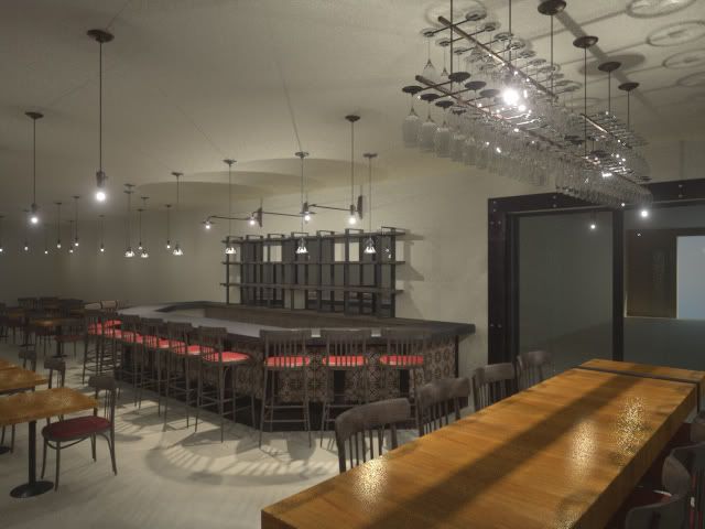
I am working on an interior of a small restaurant and bar. This is a very earl stage rendering. Not all the furniture is in. The floor will be stained concrete. The ceiling will be a little higher and open showing the duct work. The walls will be painted and have mirrors and art work. It is a very narrow space. I have about 95% of all the lighting fixtures in minus some over the bar counter. I have used the actual lighting amounts from the designer. The only natural light coming in will be from two glass doors at the end of the space. This will be published in a local magazine as well as other promo material. So, I would appreciate any input mainly about light set up. I am tiring to think it as if they hired a photographer to come in and shoot the space. I would think that a photographer would not rely on the interior lighting alone to light the space. Perhaps they would set up spot lights, use a flash. I am not quite sure. I searched the think site and found minimal resources. I see many wonderful interior renderings on the site. So user input would be AWESOME!!!!!!!!!!!!!
Thanks,
Aaron
Posted: Mon Jul 14, 2008 8:42 pm
by Asmithey
Posted: Tue Jul 15, 2008 1:38 pm
by gadzooks
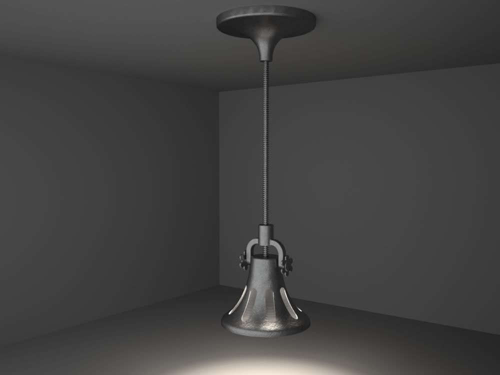
So far it looks fantastic! I especially like the pendant with the screw support rod, nice detail. Is the lighting going to be that orange in the real space?
Posted: Tue Jul 15, 2008 3:42 pm
by Brett Morgan
Looks like a great start to me, need some cornices/architraves etc, and some detail to break up the wall space, appreciate the detail you have put in already!
Brett
Posted: Tue Jul 15, 2008 4:48 pm
by KurtS
modeling & rendering look really great!
The design is to much 1985, but I guess thats not your department...

Posted: Tue Jul 15, 2008 10:40 pm
by Bubbaloo
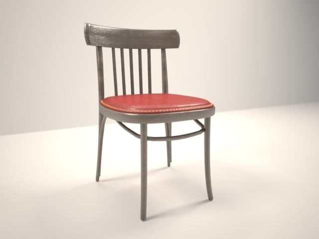
A suggestion would be to arrange the furniture not so perfectly. Give it some variance. Nice job so far. Lighting is too yellow seems like.
Posted: Wed Jul 16, 2008 12:39 am
by Asmithey
I agree. My wife says it lookes like everything is coated in nicotine from 1975. So that is the first thing I have changed. I also changed the view.
As far as the walls go there will be some art work and mirrors. Also a cool wainscot detail of 15x9 wine create panels. I am having some trouble finding good quality images to map my material for them. There will be some black steel plate details at the bar and steel plate surrounds at the doors. My view is moved to the other side of the space to catch more detail at the bar. That is really where all the design is.
Thanks for the input. It is much appreciated. Hope to have an update in the morning.
Aaron
Posted: Wed Jul 16, 2008 4:11 pm
by Asmithey
Hello,
I have attached another progress view with the new angle. There is a little bit of distortion, to lower/ middle left, to the chair and table. It looks elongated. I will try and minimize that. I did not render the glass for the light bulbs. I will probably do that in post to save render time. So you are just seeing glowing emitters below some of the the fixtures.
Things left to do.
1. Accurately model the hall way to the outside.
2. Accurately model the ceiling.
3. Model the booths. They will only be seen in the mirror reflection, in this view anyway.
4. Add the stained concrete floor
5. Add forks and spoons hanging from the chandelier.
6. Add wine add liquor bottles to the back bar area.
7. Add decor to the community table. Plates, glasses, silverware, napkins...etc.
Any comments appriciated.
Posted: Wed Jul 16, 2008 8:06 pm
by Mattia Sullini
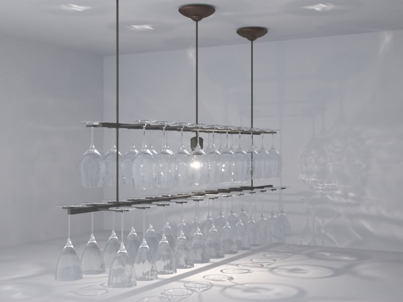
This can become great! The rack is very well done (you solved the white dots problems, then!)...
For what the light is concerned, i would try to place a pane maybe 1mx1m behind the camera, shifted on the left. This way you will achieve two goals: first you will reduce the noise you are going to get in the darkest parts of the foreground, expecially in dayshots since the openings are on the opposite end of the room, then you will fill those shadpws and get nice highlights, on tableware i suppose you are going to introduce and on the bevels of the furniture if you are going to model them. I would use a warm light to create a contrast with the blueish exterior light.
Hope this could help

Posted: Thu Jul 17, 2008 5:48 am
by Asmithey
Hello,
I hope you are right, about it becoming great, this is a new client. I need to wow them from the get go. I found some bad geometry in my wine glasses. I recreated them and the white dots went away.
The view has changed again. I am rendering it right now. Found a few mistakes but it has been cooking for 2 hours and I do not want to stop and re-render. But I like your idea about adding the emitter panes. With a 1m x 1m pane what kind of wattage do you suggest? I will have to set that up on my next test render. I think maybe the lights may be a little to cold.
thanks for the comments.
Aaron
Posted: Thu Jul 17, 2008 7:32 pm
by Asmithey
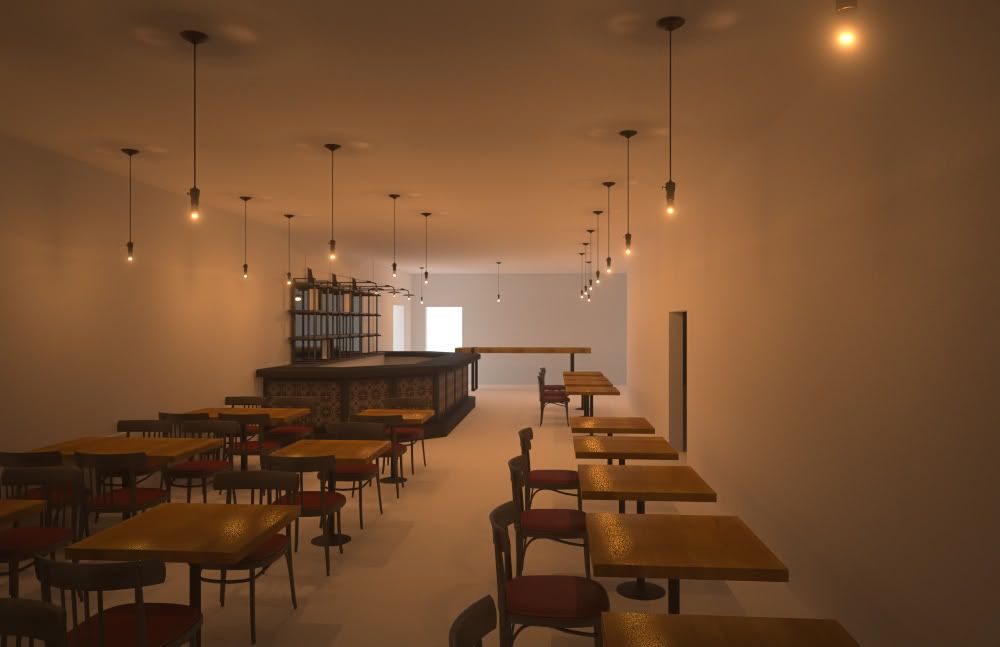
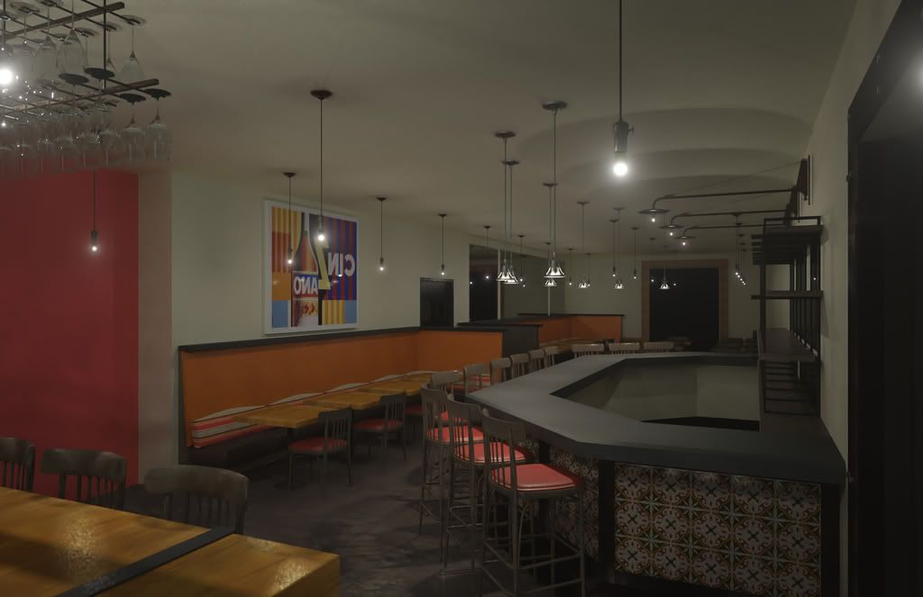
Here is an update with the modified view. The big black rectangle in the back is supposed to be a mirror. I noticed it a couple of hours after I started the render. Since it is a progress render I left it. The art work is backwards as well.
So, I just need to add some stuff in the bar area behind the counter. Once I get the ceiling info from the architect I will be able to finish it up. The lighting still needs tweaking. I think is kind of dark. Good thing for multi light. Maybe the amount light scatter in the bulbs is a bit distracting as well.
The booth seats are a shiny chocolate vinyl. I thought I made them shiny enough. So, either they are not catching much light or maybe they are not shiny enough yet. They seem to get lost in the dark.
Aaron
Posted: Thu Jul 17, 2008 8:20 pm
by KurtS
Mattia Sullini wrote:I would use a warm light to create a contrast with the blueish exterior light.
Hope this could help
I thinl Mattia has a lot of good advices for your scene. I like the warm light, and if you brighten up the outdoor light and make it a bit bluer you could get som nice color contrasts, and some interesting reflections in the glass etc.
Posted: Wed Jul 23, 2008 10:13 am
by contact7
Nice image, and it's only a wip. It can get amazing!!
The glowing lamps give a nice atmpsphere. How did you do that?
Mark
Posted: Wed Jul 23, 2008 2:31 pm
by Eric Lagman
This last one is much better. The lighting was too strong in the others I think. This result is better from a lighting standpoint. Now all thats missing is the details that you mentioned earlier. What is the floor material? Its not reading as anything in particular to my eye. Closest thing I can think of is a stained concrete? If so I think it needs to be a little more shiny.
Posted: Wed Jul 23, 2008 5:28 pm
by Asmithey
Here is the image 99% complete. I need to fix the glasses on the tables. they rendered grey for some reason.
Eric, yes the floor is stained concrete. I may try adding a small amount of shine to it as you suggest.
Mark, for the light glow I enabled some light scatter to the emitters in the preview/MXI options of Maxwell Render.
I did place a light panel behind the camera as suggested.
As this is the final to be approved, I would greatly appreciate any final critiques.
Also, this posted image is 800x533. The final image will be 2700x1800. This 3.38 times larger than the size rendered for this post. Is it right to assume that the final image would take 3.38 times longer? It reached 20.25 SL in 16 hours at 800x533. I am trying to decide if I need to use an render offsite render farm or not. I have time to let cook for 50 to 60 hours anything more than that could be a problem.
Thanks,
Aaron