Page 1 of 2
Maxwell or photograph mini challenge.
Posted: Thu Jan 18, 2007 4:22 am
by Tim Ellis
Image 1:-
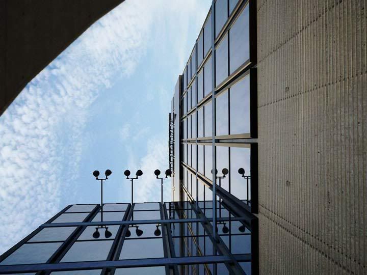
Image 2:-
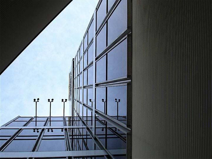
Which is the photograph and which is Maxwell?
Tim.
Posted: Thu Jan 18, 2007 5:39 am
by tokiop
hehe considering your texturing skills it's possible maxwell is number one !

Posted: Thu Jan 18, 2007 5:51 am
by Thomas An.
I prefer 1 ... even if the photo is 2 .. the photo is crappier in this case than the render.
The only comment is, that there is a low poly issue on the upper left hand corner.
Posted: Thu Jan 18, 2007 6:45 am
by 3dtrialpractice
ditton on the faceted look on the object blockin camera..
the Biggest givaway it seems is the serious jpg artifacting on the second image.. maybe its just me tough..
still both look like photos.. even if there are small givaways yousucceded in making me look hard at the difference.. so in my book both are photo beacasue of that.. one is just a maxwell photo

Posted: Thu Jan 18, 2007 10:26 am
by arch4d
yep, first one is maxwell, due to the object in front left.
it has too few polys.
but i prefer this one two, looks way better than the photo

Posted: Thu Jan 18, 2007 11:01 am
by Fernando Tella
That faceting could be due to faults when constructing the building. It's easy to find faceting in curved shapes made in concrete; anyway I still think the first one is the render and the second one the photo; the last one has the effect of rain in the facade and the horizontal plates reflections are more real/irregular.
Posted: Thu Jan 18, 2007 11:27 am
by AndreD
...the sky/clouds perspective looks odd in picture 1...
Posted: Thu Jan 18, 2007 12:04 pm
by Mr Whippy
2nd is photo, can see so much more detail in and around the window frames...
1 is good though, it almost looks like some landing from using a wide open lens has been added into the corners... good stuff!
Unless of course your simulating a decent prime lens

Just my 2p, but with the exposure on the building like that (as with the real photo) would leave the sky more over-exposed in a conventional 5 stop film/digital exposure...
So if your sky was maybe 10% brighter the glass would light up more and the sky white out more...!?
Dave
Posted: Thu Jan 18, 2007 12:29 pm
by Mihai
Looks like it wasn't modelled the same as the image. In the photo the space between the windows is different and you get more reflections which is nicer looking.
Posted: Thu Jan 18, 2007 2:20 pm
by acquiesse
I agree that the render is number one, it was the material at the edges of the windows which gave it away for me. On the photo there is a subtle
complexity to that material, but on the render it is quite flat.
I doubt I would have questioned it being a photo if you hadn't said... Very impressive
Posted: Thu Jan 18, 2007 4:19 pm
by tom
This is very nice Tim! Thank you!
Yes, the second one is photo. I can see it from high chromatic noise and lens distortion.
Posted: Thu Jan 18, 2007 4:24 pm
by -Adrian
I voted #2 being the photo, but it's awfully hard, both images have things you'd consider less realistic, kinda funny
Posted: Thu Jan 18, 2007 5:32 pm
by rusteberg
mullion details...... concrete map seems a little raw in the foreground.
Posted: Thu Jan 18, 2007 7:05 pm
by tokiop
Posted: Fri Jan 19, 2007 1:57 am
by ricardo
Had to stare at them for a while - the two big marks on the concrete look too much alike but the windows' framing decided it.
Solid!

If there was no side by side comparison it would be 50/50 chance.
Ricardo